Table of contents
Open Table of contents
Overview
- Client: Altum Inc. (Startup)
- Duration: Nov. 2019 – Oct. 2020
Summary
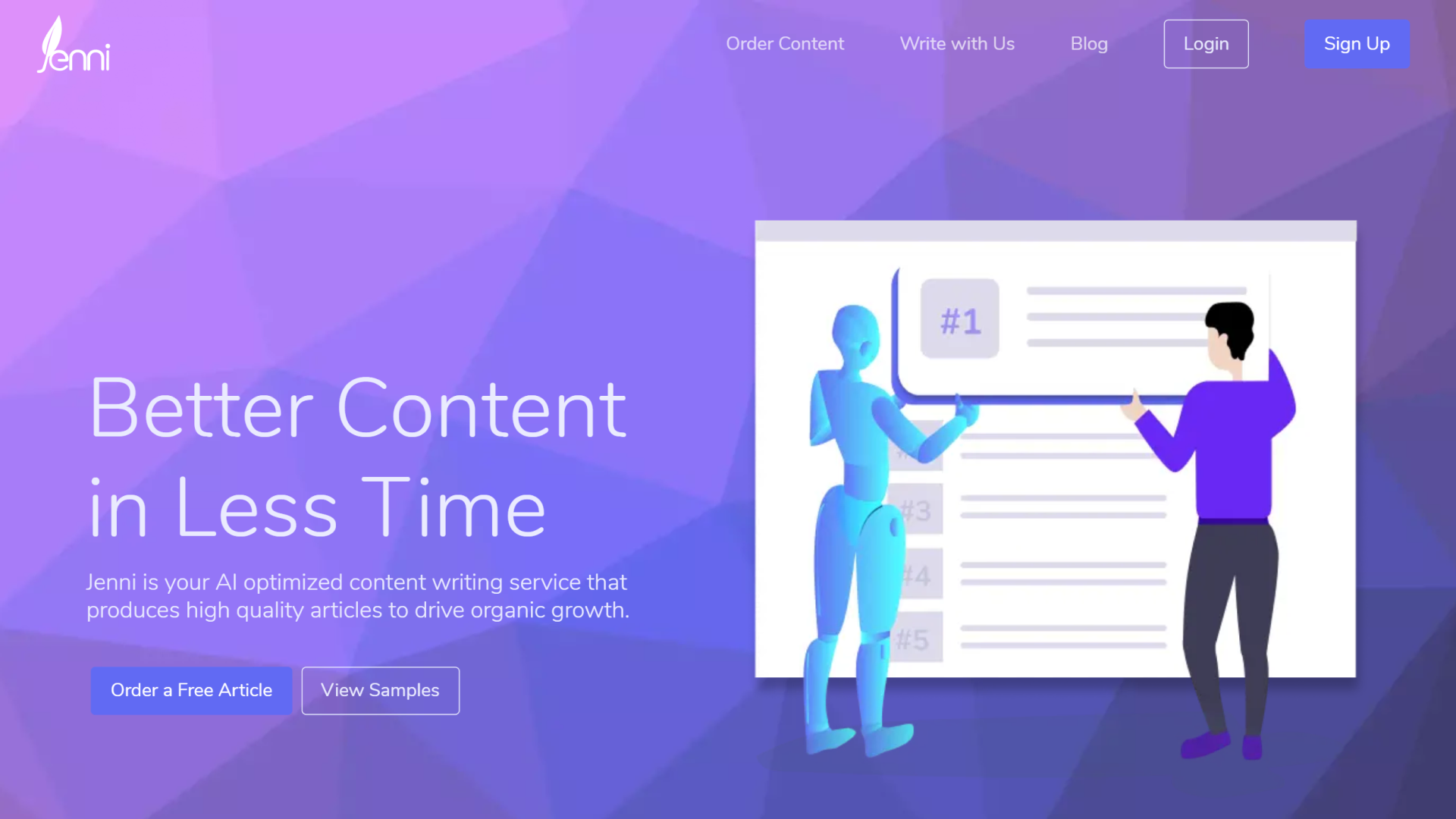
- Jenni, Altum’s content writing service, needed a new landing page that reflected Altum’s changing business models and focuses.
Roles
- UX Designer, UI Designer, User Researcher
Background
Altum saw the need to add and alter content on the landing site to better reflect the Jenni writing service.
Goals
We hypothesized that making both simple iterative changes and major visual overhauls would result in an increase in conversions (# of accounts) and signups (# of payment info submissions).
Process
The steps of Altum’s design process are:
- Define. Defining our users and the MVP design.
- Ideate. Ideating on design possibilities.
- Test. Testing pre-release ideations.
- Observe. Observing post-release outcomes.
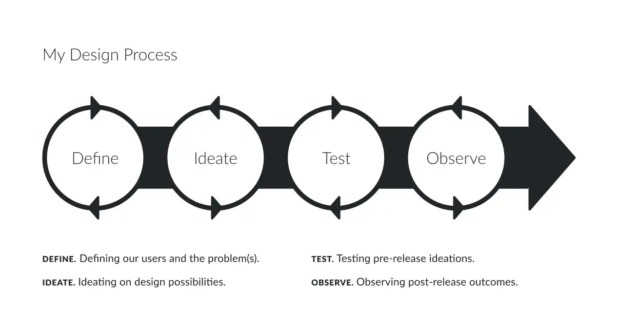
The Altum design process.
Define
Our primary target users were SEO marketers and marketing agencies.
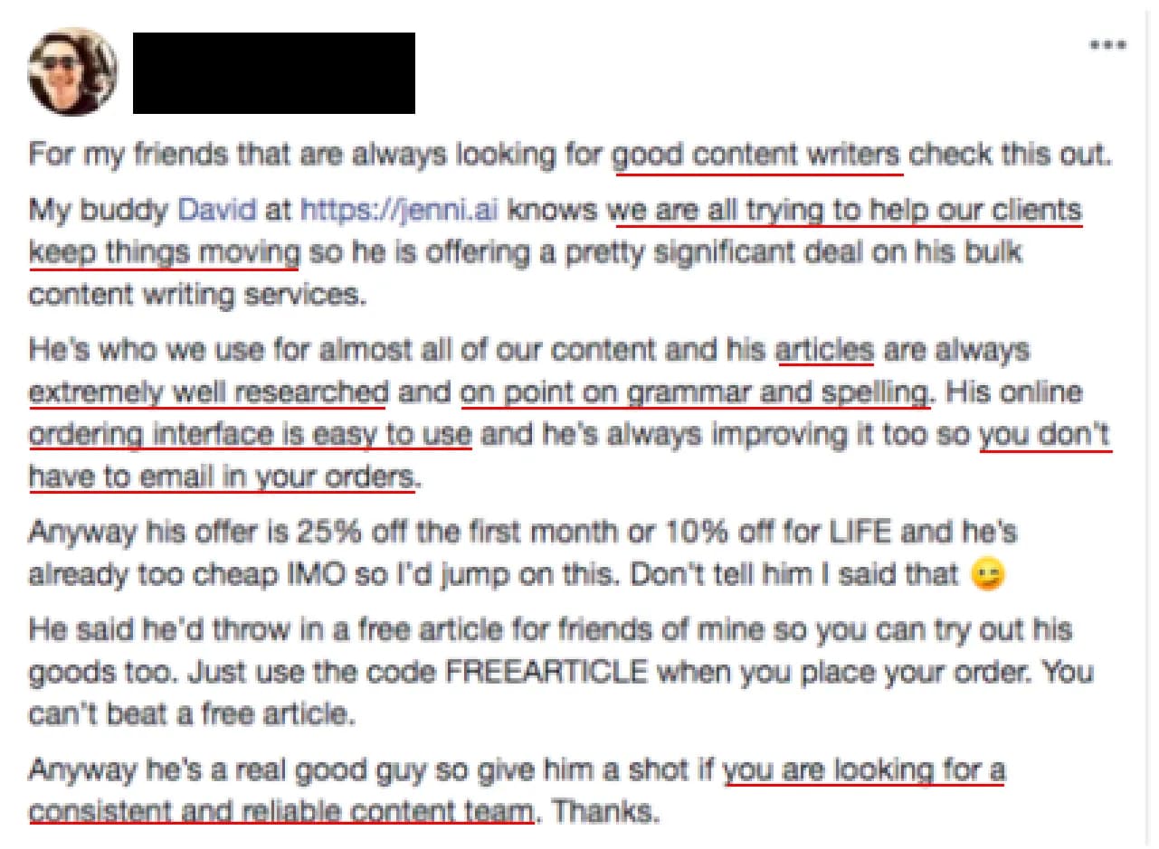
A Jenni user revealing some of the underlying needs for SEO marketers in a Facebook post he made to help share our promo offer.
Ideate
An example of the original testimonial carousel.
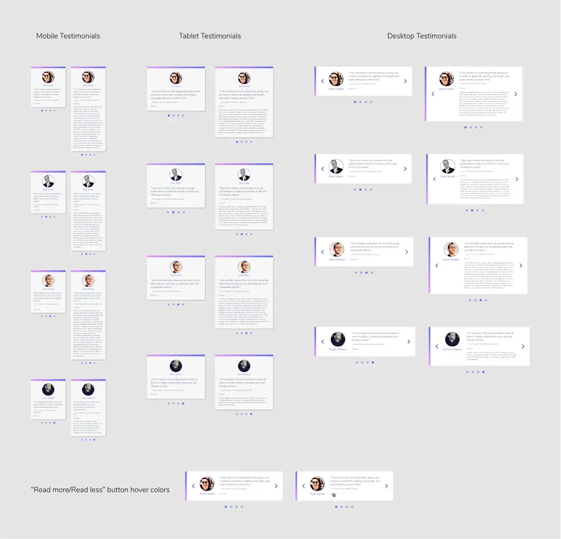
The testimonial carousel’s responsive layout redesign.
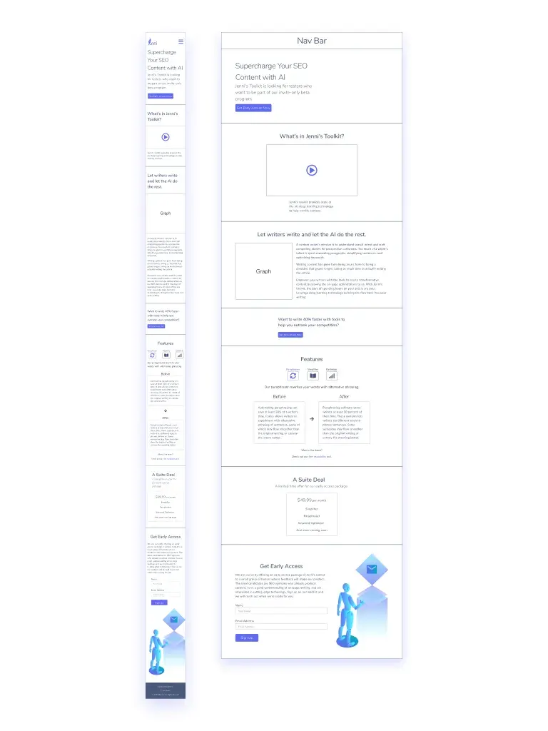
A mixed-fidelity wireframe of the desktop layout for a page announcing the SaaS transition.

An older redesign of the landing page. We updated image assets and included new sections.
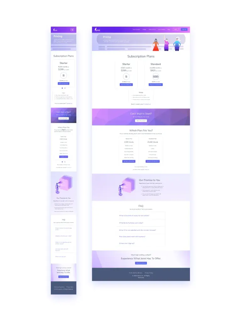
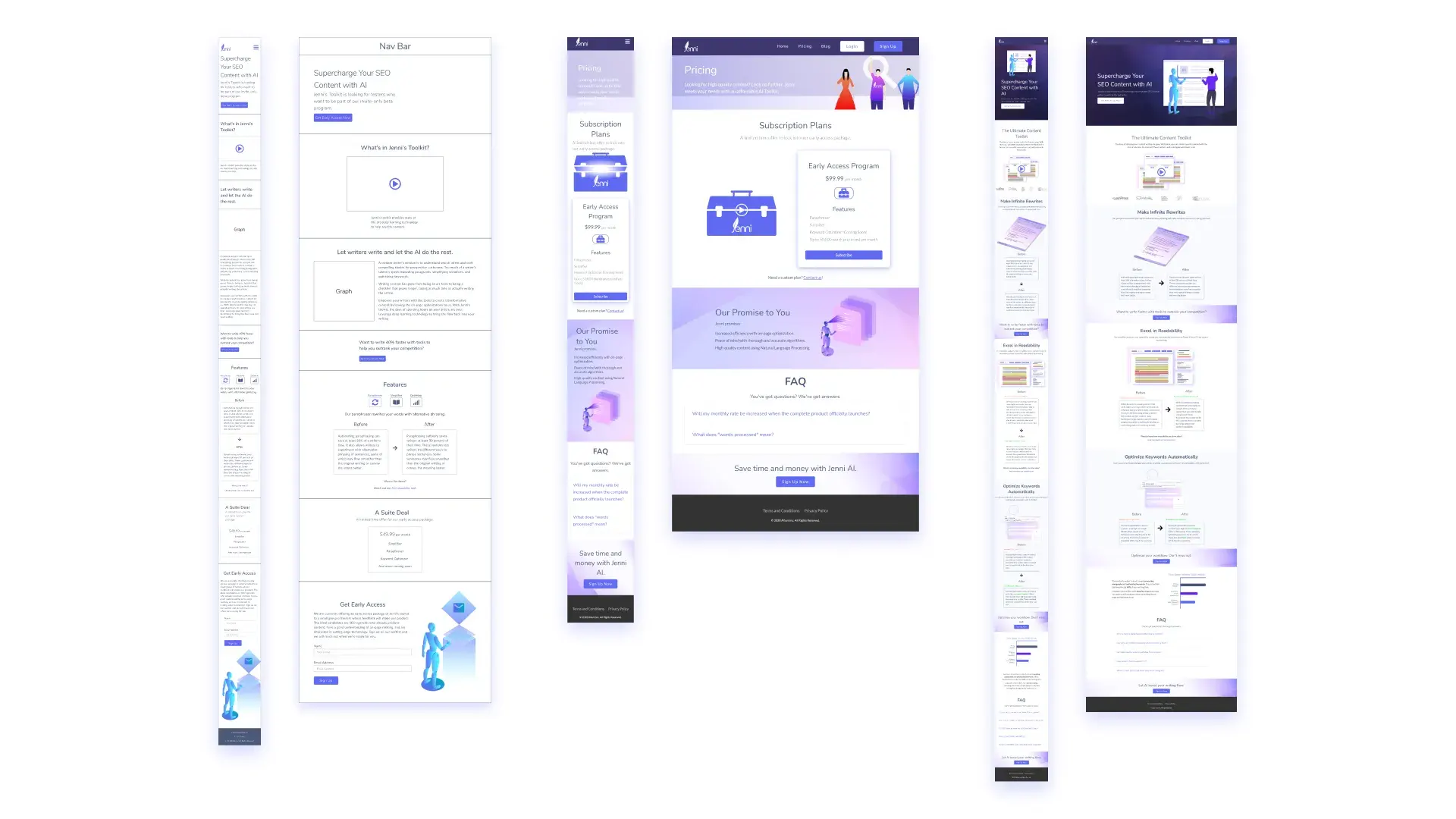
Desktop layout for Jenni’s pricing page.
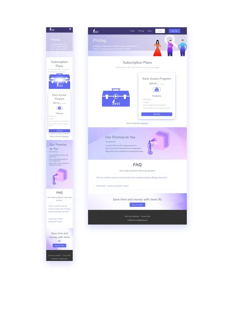
Older mobile and desktop layout for Jenni's pricing page.
A Webflow migration that consolidated our landing site elements and let us include more visual appeal.
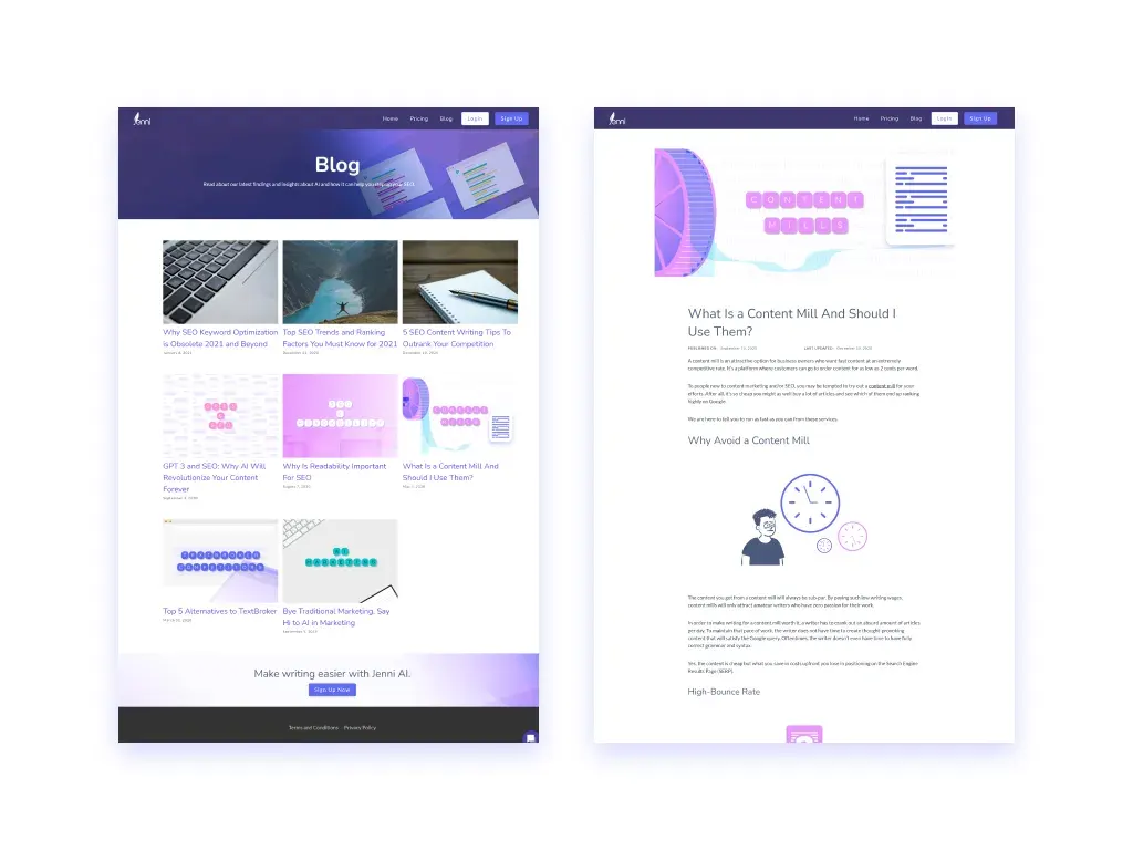
A blog page both let clients read up on valuable content writing tips and helped jenni.ai rank on search engines.

A site structure flowchart that helped ensure proper navigation between the landing site and the login/signup page.
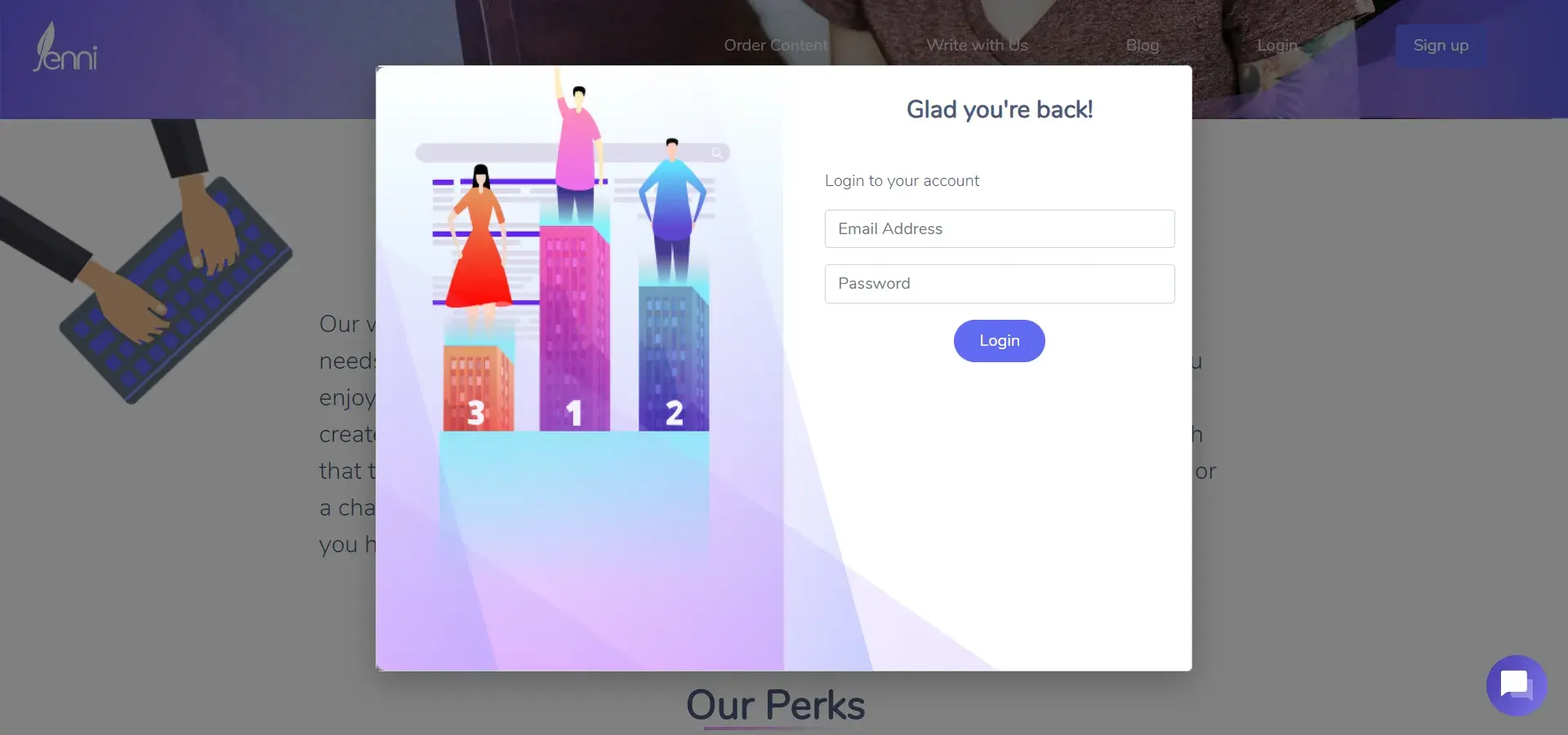
A screenshot of the old login modal.
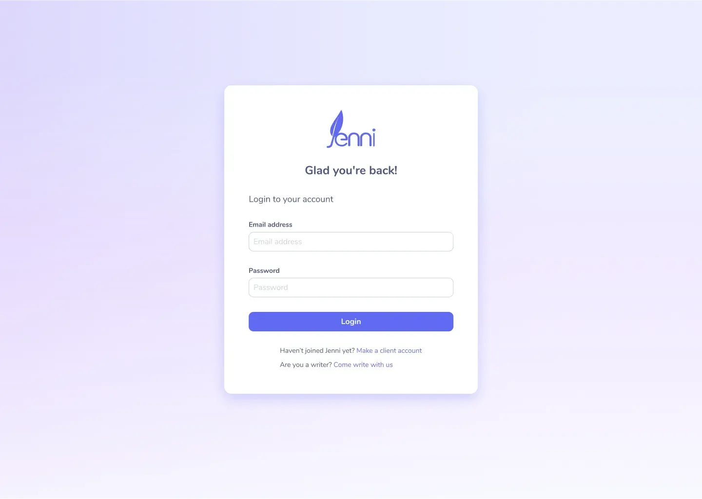
Login form on the separate app.jenni.ai site.
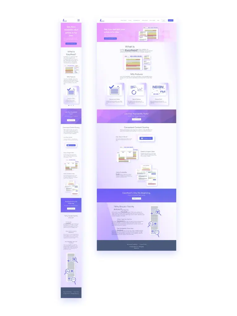
Page for EasyRead that marketed its capabilities and hosted the tool’s actual interface.
Test
Our main testing methods included:
- User testing to gain a qualitative perspective on the effectiveness of intended landing site design changes.
- A/B testing using Crazy Egg, a service that records and highlights user interactions.
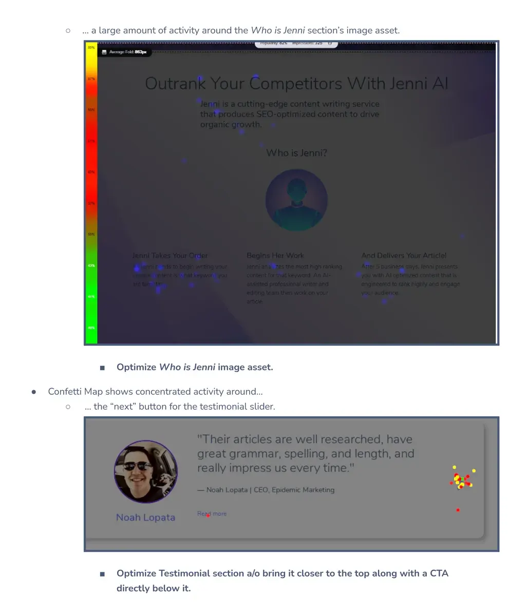
Part of an audit report where I used CrazyEgg’s heatmap and confetti features to highlight areas with frequent user activity. I believed these areas took priority in the next redesign.
Observe
Based on our success metrics of an increase in conversions and an increase in signups, we found that altering the landing site resulted in more conversions and signups for certain changes.
Reflection
I learned that by making simple changes and keeping a good record of wireframes, UI elements, etc. one could provide meaningful impact for the business.